Design & Style Frames
As Amazon prepared to premiere their highly anticipated "Rings of Power" series, they sought an extensive brand takeover that mirrored the series' style. As designer, I was tasked with developing a cohesive visual identity that spanned multiple platforms and touchpoints. This spanned from designing graphics for delivery trucks and creating themed shipping boxes to orchestrating website takeovers and completely revamping the Amazon Prime Video logo.
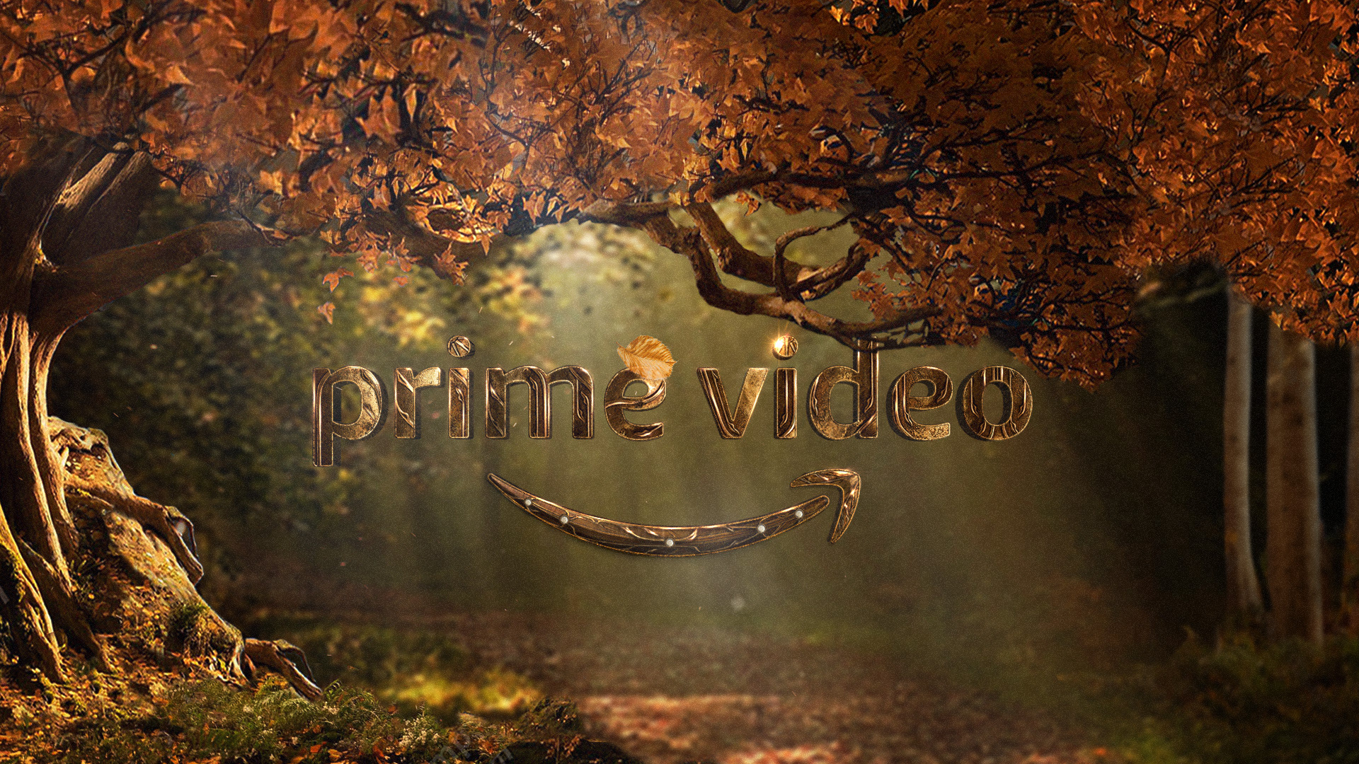
Prime Video Logo Takeover
For the first time in Amazon's history, they permitted a fully customized version of their Prime Video logo. My approach to creating this unique look involved seamlessly merging the Prime Video logo with the distinctive design language of the "Rings of Power" series, resulting in a harmonious and visually compelling brand identity. Seen below is a story board of the logo in action!
Boards for animated sequence



Shipping Box Takeover
Stepping beyond my usual digital realm, I was also tasked with designing Amazon shipping boxes that evoked the distinct character groups from "Rings of Power." For the Elven-themed box, I incorporated intricate details of character shields and swords, creating a gold-armory aesthetic that beautifully encased the recipients' goods.
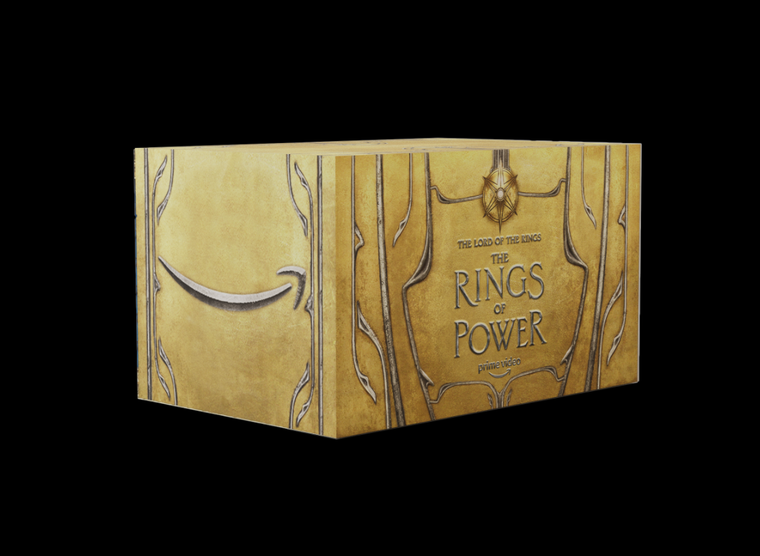
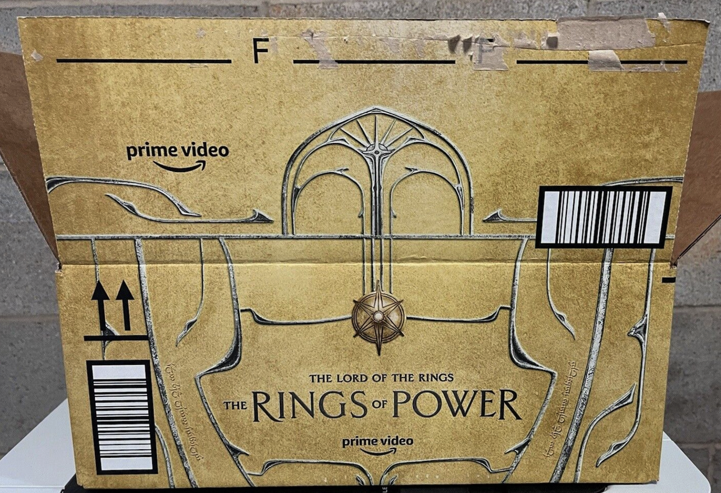

Alt look
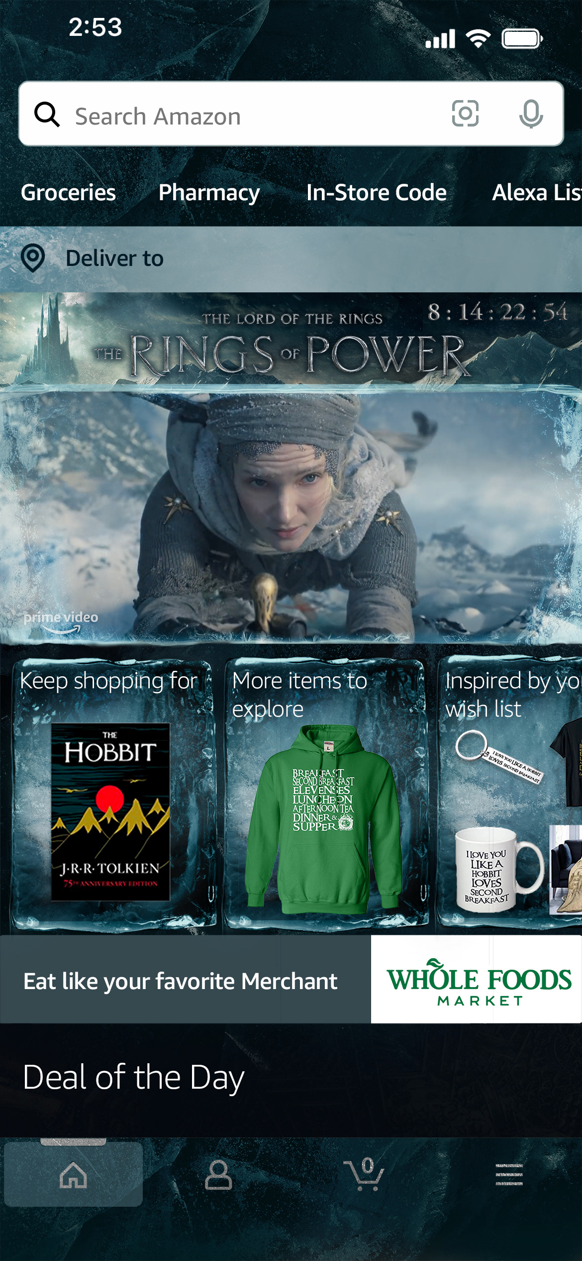
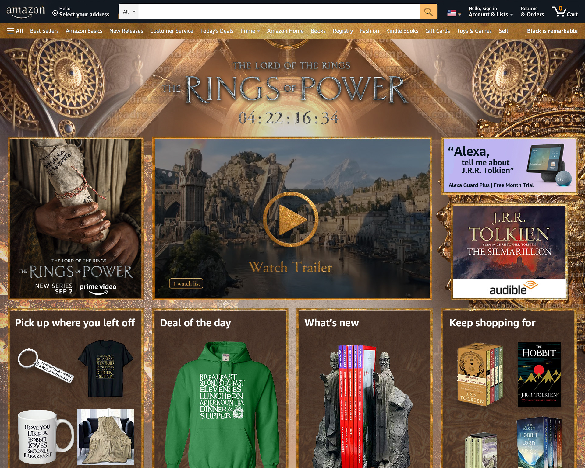
Amazon Page Takeover
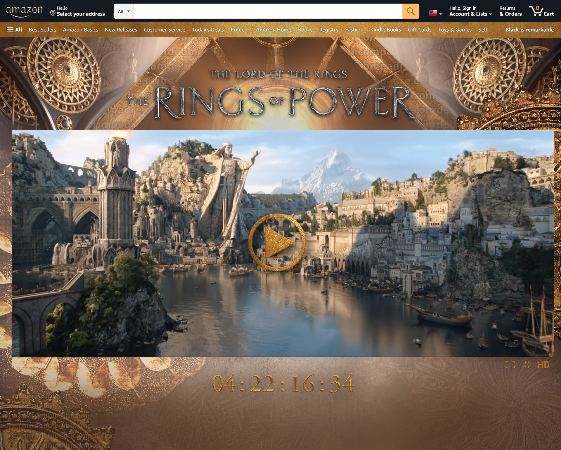
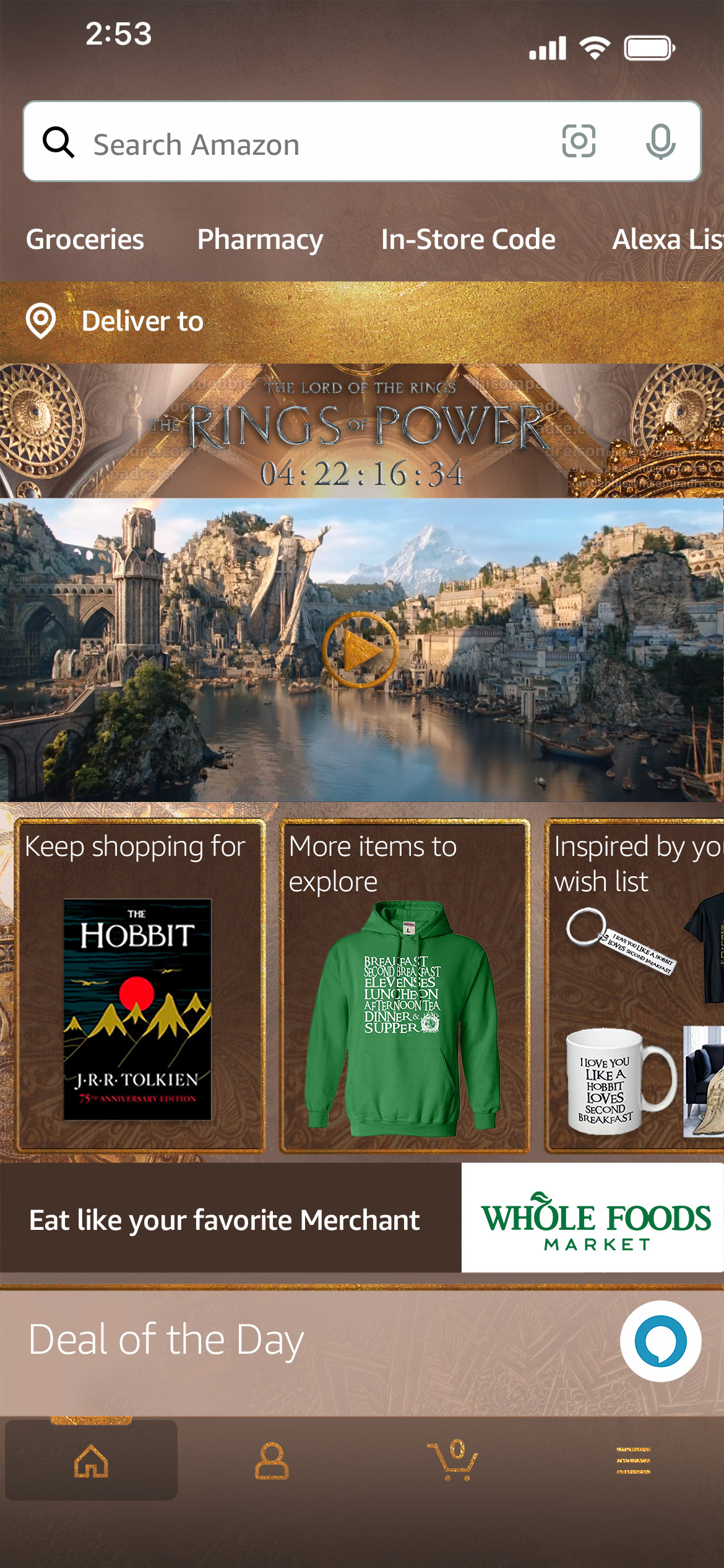
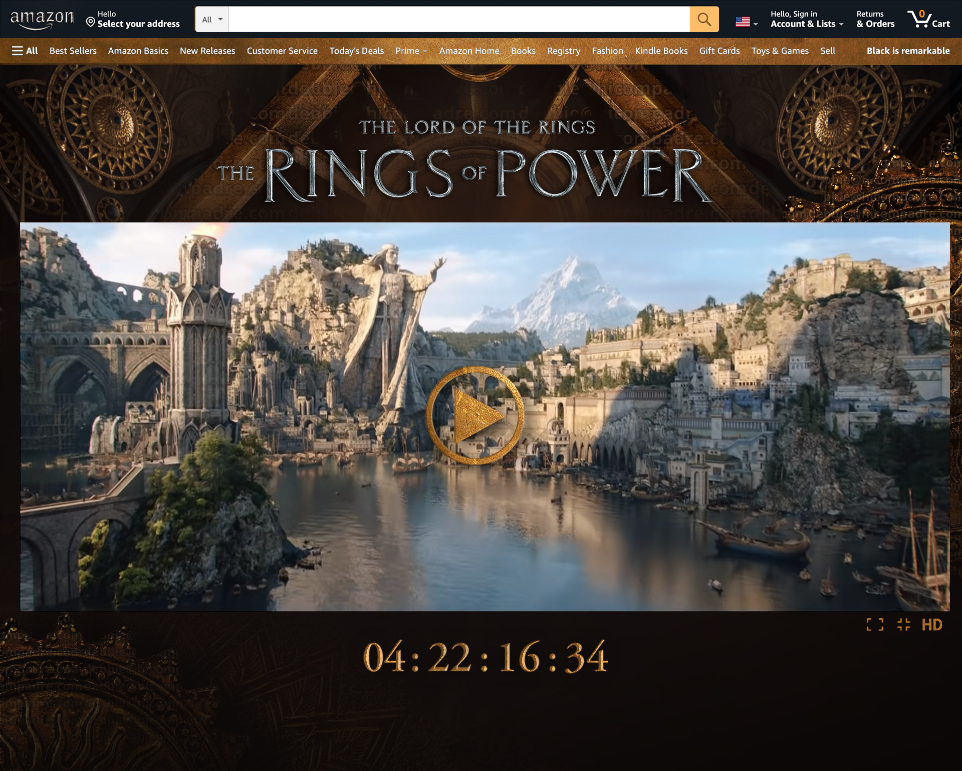
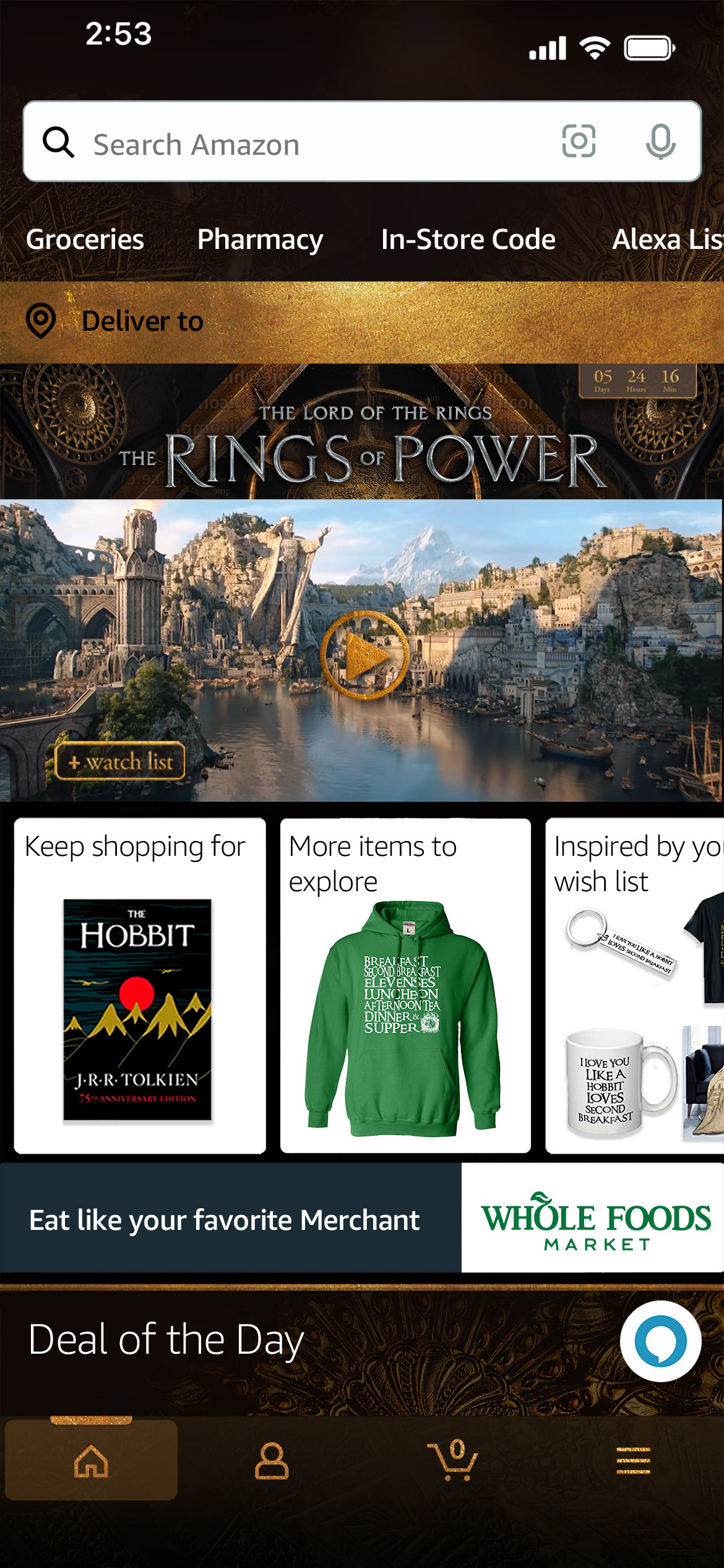
In the lead-up to the series' release, Amazon aimed to build excitement with a comprehensive website takeover. This takeover included countdown clocks, a play window, and a mobile-friendly design. Look 1: Ice, drew inspiration from the show's harsh environments, showcasing the peril and beauty of rugged, cold landscapes. Look 2: Light/Dark Mode, captured the warm interior settings of the characters, blending architectural elements with a sense of power.
Look 1: ICE


Look 2: Light/Dark Mode

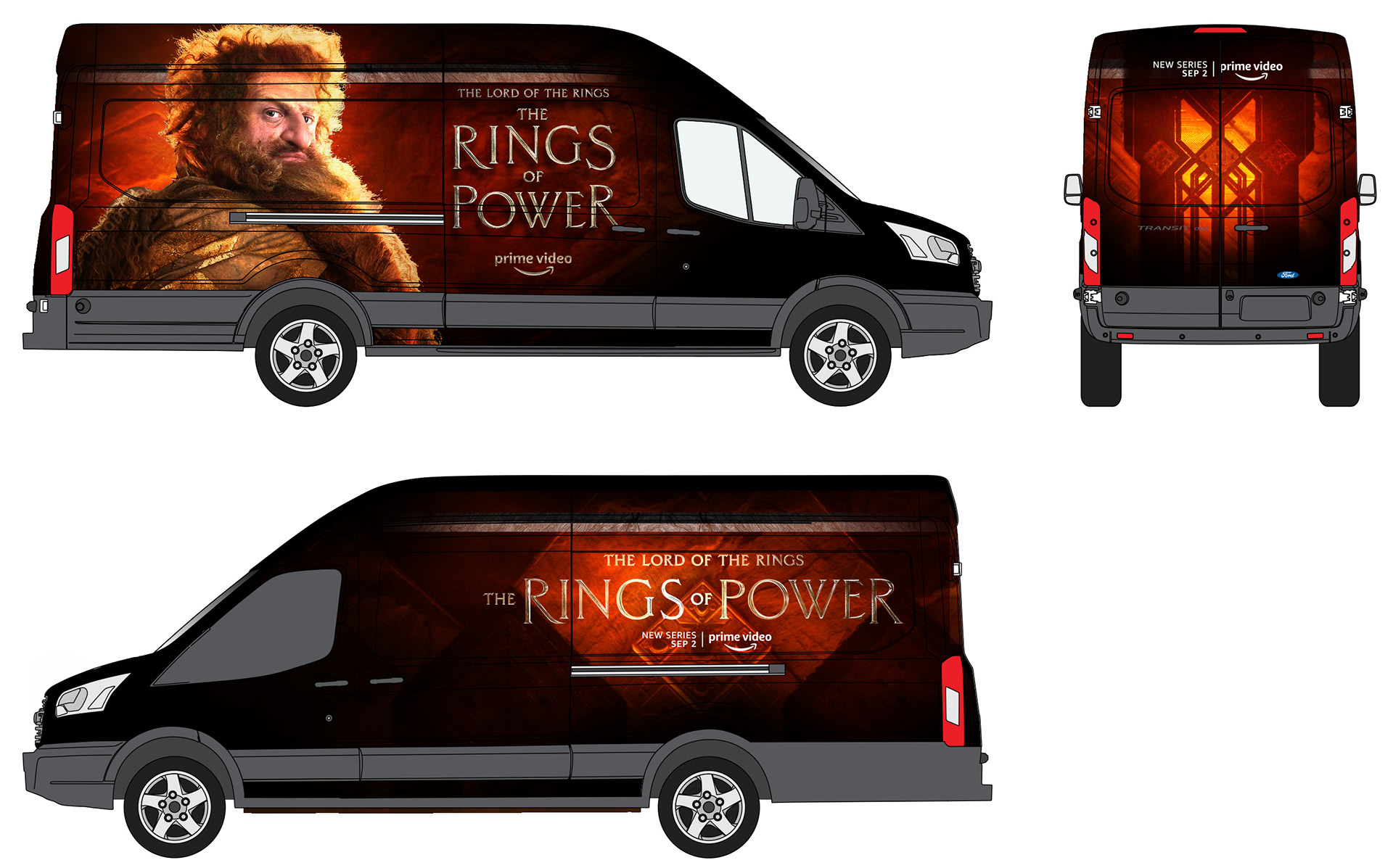
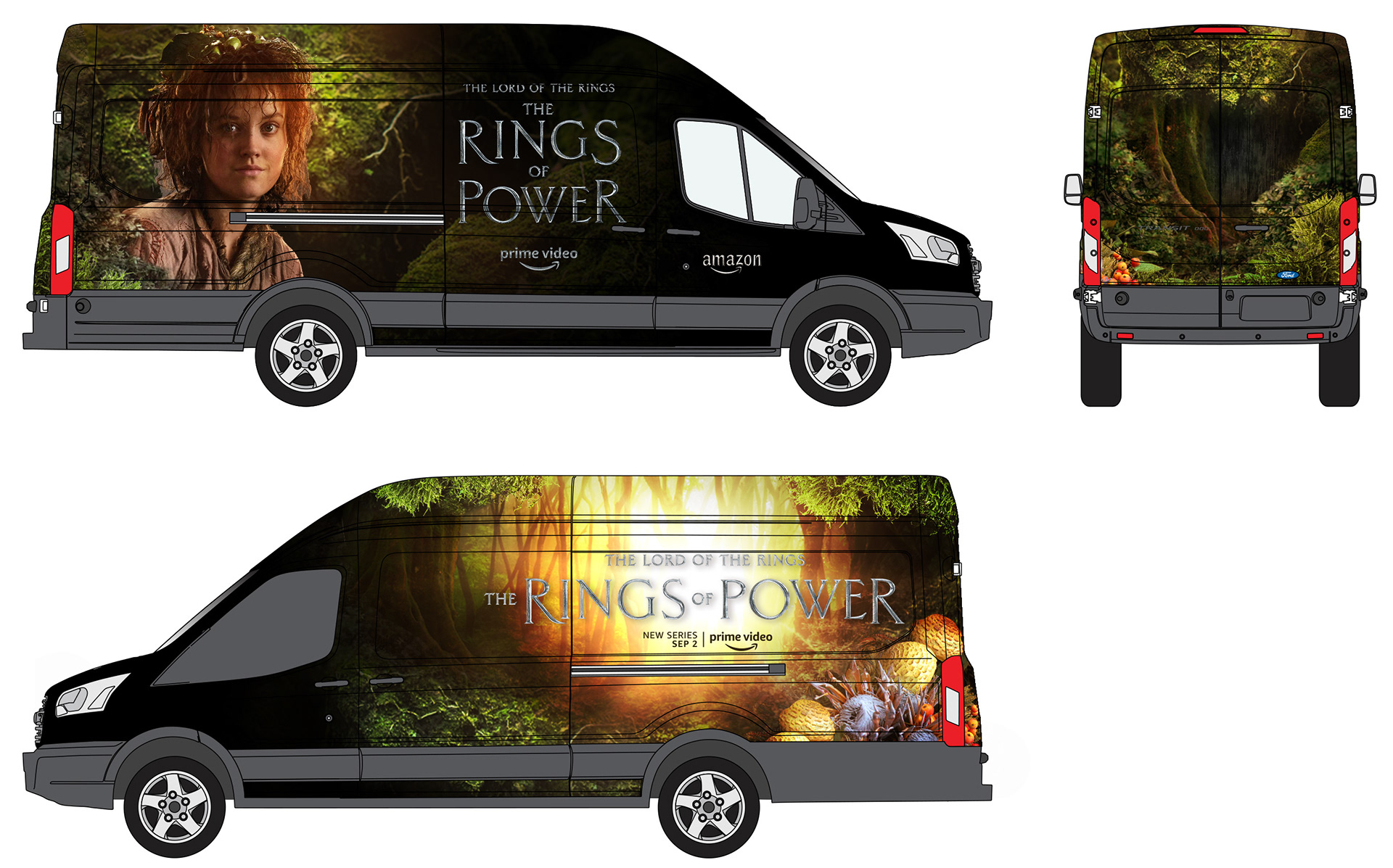
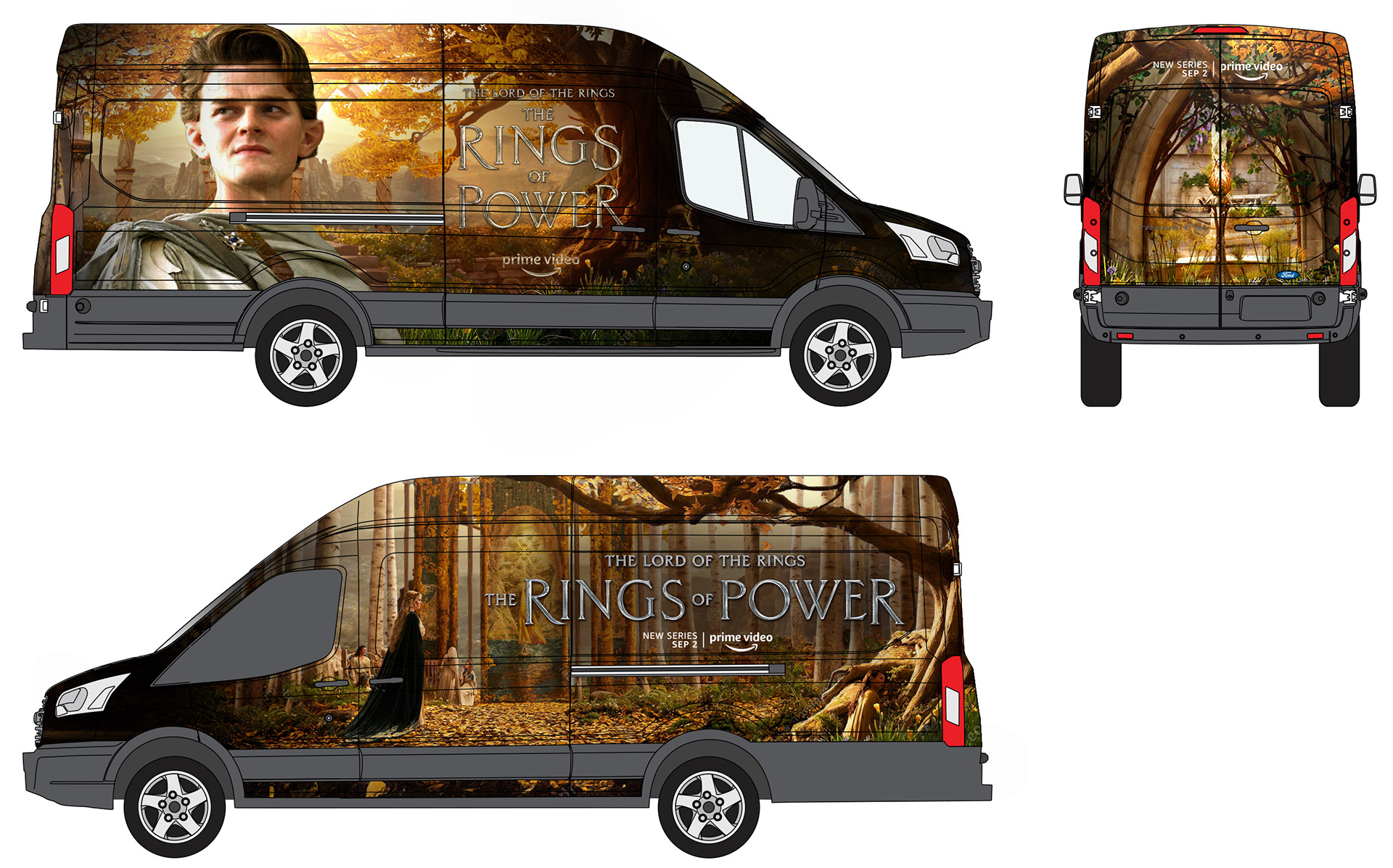
Delivery Van Takeover
Another integral element of the "Rings of Power" branding takeover was the design of wraps for Amazon delivery trucks. My concept for these wraps prominently featured the series' lead characters, offering a dynamic and visually engaging representation. Each truck wrap not only showcased these central figures but also provided a glimpse into their unique homelands, effectively transporting viewers into the diverse and richly detailed world of the series. This approach ensured that the branding was not only eye-catching but also deeply immersive, sparking curiosity and excitement among both fans and casual observers as they encountered the trucks on the streets.
